
In honor of National Black History Month this February, we sat down with longtime friend of Catalyst, Ellen Turner, Founder, President and CEO of the William Everett Group (TWEG) with over 20 years’ experience in IT and the public sector. TWEG is a Black-owned, women-owned consulting firm based in Chicago and has been a close collaborator of Catalyst for several years.
Conversations like these help us gain perspective on the challenges, advantages, and importance of minority-owned businesses working in the government technology space.
Here’s what Ellen remarked in our interview.
—
What path led you to founding TWEG?
After spending many years working and starting other firms, I decided that I wanted to create a women and Black-owned management and technology firm. Over the years, it was clear to me that there was a market for such a firm. I had worked hard to ensure the success of others and thought perhaps I could do this for myself.
I also had some very specific goals and purposes for my firm: I wanted to focus on offering careers in consulting to folks in brown and Black communities. In all my years working with and for consulting firms, I still believed there were not enough opportunities being afforded to people in those communities.
I also wanted to engage in work that fulfilled my need to be in the public sector and a quasi-public servant, as well as working on projects that helped improve the lives of people in our communities.
It was wonderful to find a group of highly qualified team members that shared my aspirations.
When your team is working with a public sector client, how do you keep accessibility and inclusion front of mind? How do you make sure your solutions work for all constituents?
The beauty of having a diverse consulting firm is that we don’t have to work hard to achieve this goal. We think very strategically and intently about where and who we place on our consulting engagements. Sometimes it can be intentionally in an environment that isn’t particularly diverse. We believe that most people are caring and appreciate the opportunity to learn and engage with others and to understand the experiences of people who may have different life experiences.
We find that this helps everyone grow and become better leaders and colleagues.
What public figure, living or deceased, do you look up to most and why?
Of course, the main person was my grandfather, William Everett Rozelle. He was most admired for his love for his family, his dedication to our community, and his influence on my dreams. The person I also admired the most is President Barack Obama. His presidency, which I thought I’d never live to see, gave me so much hope for my children and grandchildren. My grandchildren grew up only knowing at first that there was a Black president, and it seemed very normal to them. I was elated and so encouraged for the future.
In your opinion, what unique perspective do minority-owned businesses bring when deploying public sector technology?
Most minority-owned firms have worked extremely hard to start and maintain a business. They have had to make investments of their hard-earned dollars and have such a deep desire to showcase the fact that we perform as well as Tier One firms (sometimes because our teams come from those firms).
We don’t take the opportunities that we win, whether as a prime or subcontractor, for granted and we truly have the desire to succeed. When we do, our clients also win.
We have a deep understanding of their challenges and look at them as partners that we advise in a way that will help them shine. We genuinely care and want to prove that they can get great value and performance from our companies.
What advice and/or resources would you recommend for underrepresented youth who are looking to work in the government technology space?
Part of our company’s corporate giving and culture is preparing the next generation of youth in at-risk communities for working in consulting and particularly government technology. We connect with students from the Chicago Public Schools, City Colleges, Chicago State, and the Austin community to offer them an opportunity to shadow our teams. They learn the discipline of working on projects that require a great deal of listening, patience, and high standards. We showcase the projects we have worked on that relate to their lives directly, so they understand how this work improves the lives of others and those that live right in their homes and neighborhoods. It is extremely rewarding.
—
As technologists in the public sector, we must always strive for inclusivity, accessibility, and transparency in our solutions, which includes learning more about underrepresented communities and constituents alike. Thank you, Ellen, for taking the time to chat!
This blog is a continuation of our reflections on the importance of minority-owned businesses in the government technology industry. Check out our celebration of Asian American History Month from May 2021 here.
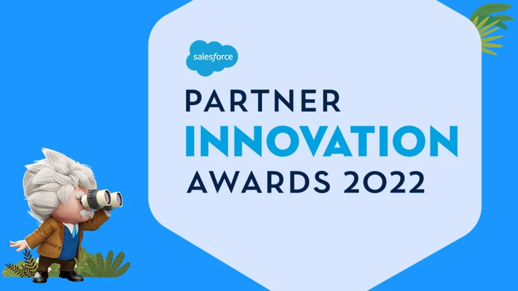
 Catalyst Consulting, a proud Salesforce Partner, has been awarded this year’s Salesforce Partner Innovation Award for the Public Sector category. The team has been recognized for the implementation of the City of Toronto’s non-emergency service center, “Toronto At Your Service,” built on Salesforce. The award will be presented at Dreamforce on September 19-21, 2022, in San Francisco, California.
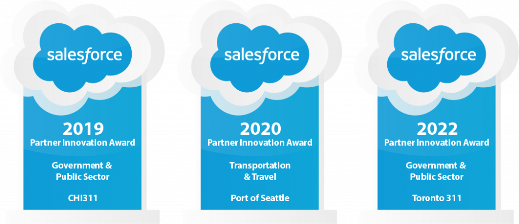


Recent Comments